Instron Diagnostic Tool.
UI/UX Design, Visual Design, Software Dev
Code Architecture: C#, XAML, MVVM, and WPF
Design Tools Used: Adobe XD, Illustrator, Photoshop, and Microsoft Blend
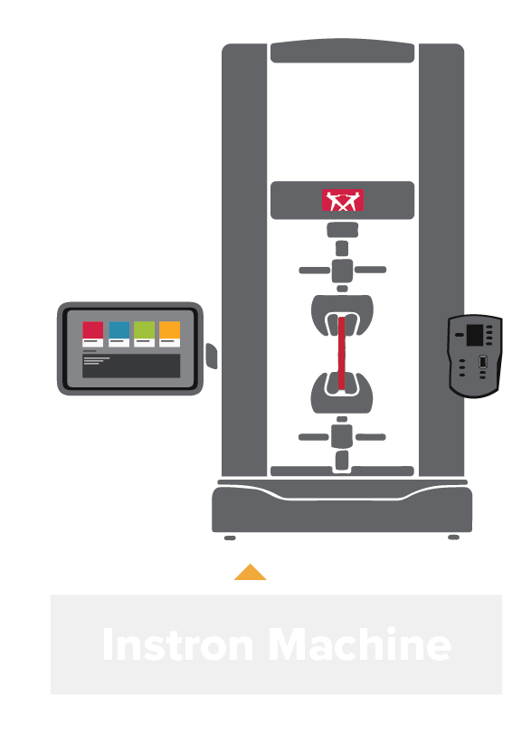
Instron manufactures test machines that evaluate the mechanical properties of materials (e.g. rigidity/strength). When a machine encounters any hardware errors, the engineers use the Diagnostic Tool to pinpoint the cause of the error.
I redesigned and overhauled the code of the desktop diagnostic tool used by 300+ technical support & service engineers globally. Prior to the end of the project, the business team began plans to monetize the tool.
Summary:
Part I: The Problem.
Identifying user pain points and identifying inefficiencies.

Confusing layout.
The previous system’s plain-text, tab structure had little depth, making it difficult to find specific functions and tools, thus creating significant time inefficiencies.

Dense & intimidating information.
New engineers often found the tool intimidating to use due to the dense amount of information presented. Significant onboarding was required, thereby creating further time inefficiencies.

Not touch-screen friendly.
The previous tool was built for use only with a keyboard and mouse; this was difficult with Instron’s new touch-screen controlled machines and made it unintuitive to diagnose new machines.

Outdated branding.
The company’s branding was updated in 2016 and the interface of the Diagnostic Tool was not changed to reflect it, creating a mismatched brand identity.
Part II: Discovery.
Finding design and code solutions.
As the only designer, I was responsible for exploring solutions and conducting usability tests to validate them.
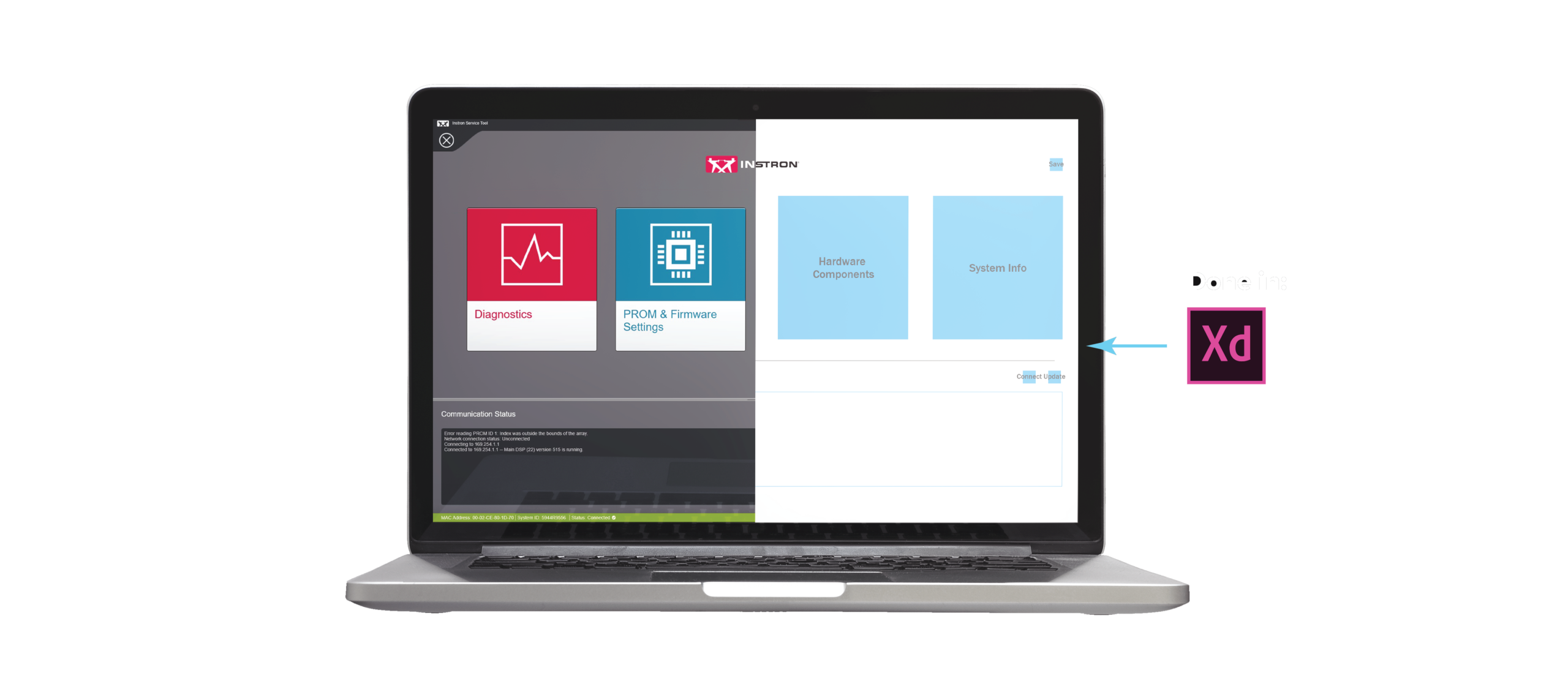
I mocked up the screens on paper before proceeding to wireframe in XD. You can view the interactive wireframe by clicking the button below.
Throughout this process, I worked closely with the tech support and field service engineers to ensure the solutions were effective and optimal. Most notably, I conducted A/B Testing and user interviews to examine user behavior. For example, organizing information in a constantly-updating table (described later) is a solution I reached from understanding how the users interpret and use the data in the tool.
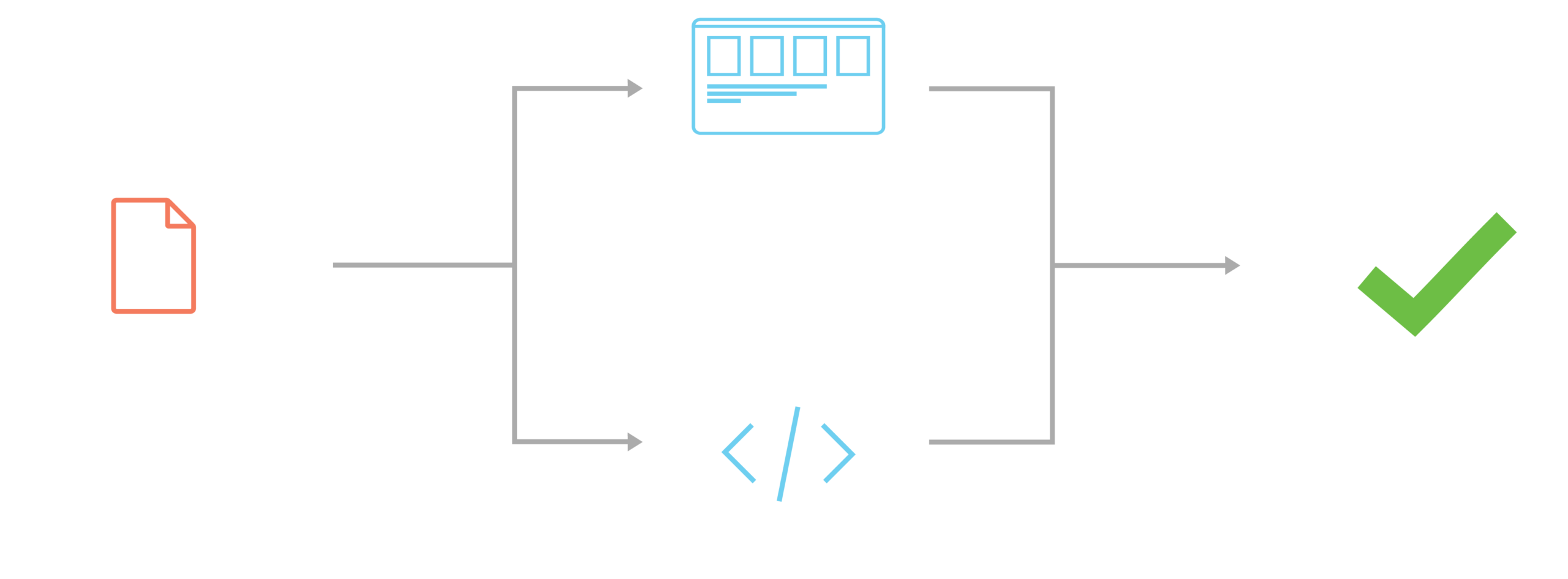
Code considerations.
The coding architecture I used for the project was Model-View-ViewModel (MVVM), which you can learn more here. Simply put, there are now three levels of code: one controlling the back-end, one controlling the front-end, and one linking both pieces together. This multi-level architecture enables code modularity and I designed my solutions to take advantage of that modularity.
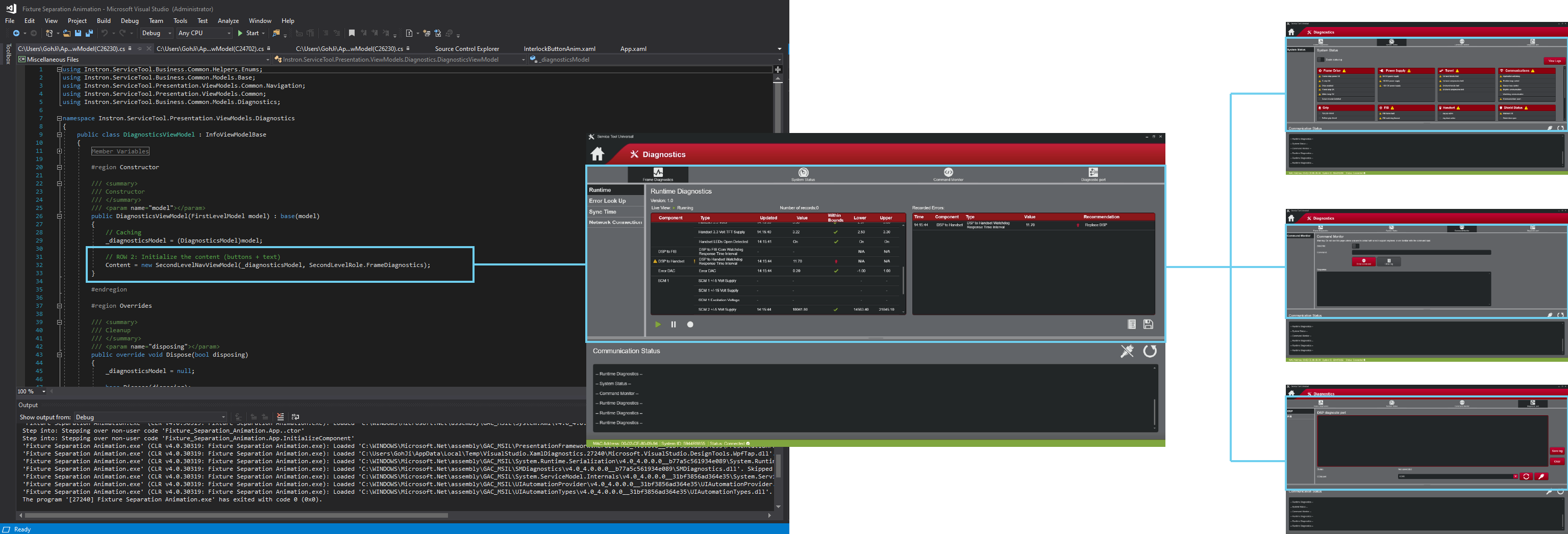
For example, the above code snippet enables me to swap pages within a certain category ('role', represented by distinct colors), thereby giving me greater control over the category organization of functions.
Part III: The Solution.
A new application with new navigation.
The solutions were designed with an understanding of how the software worked
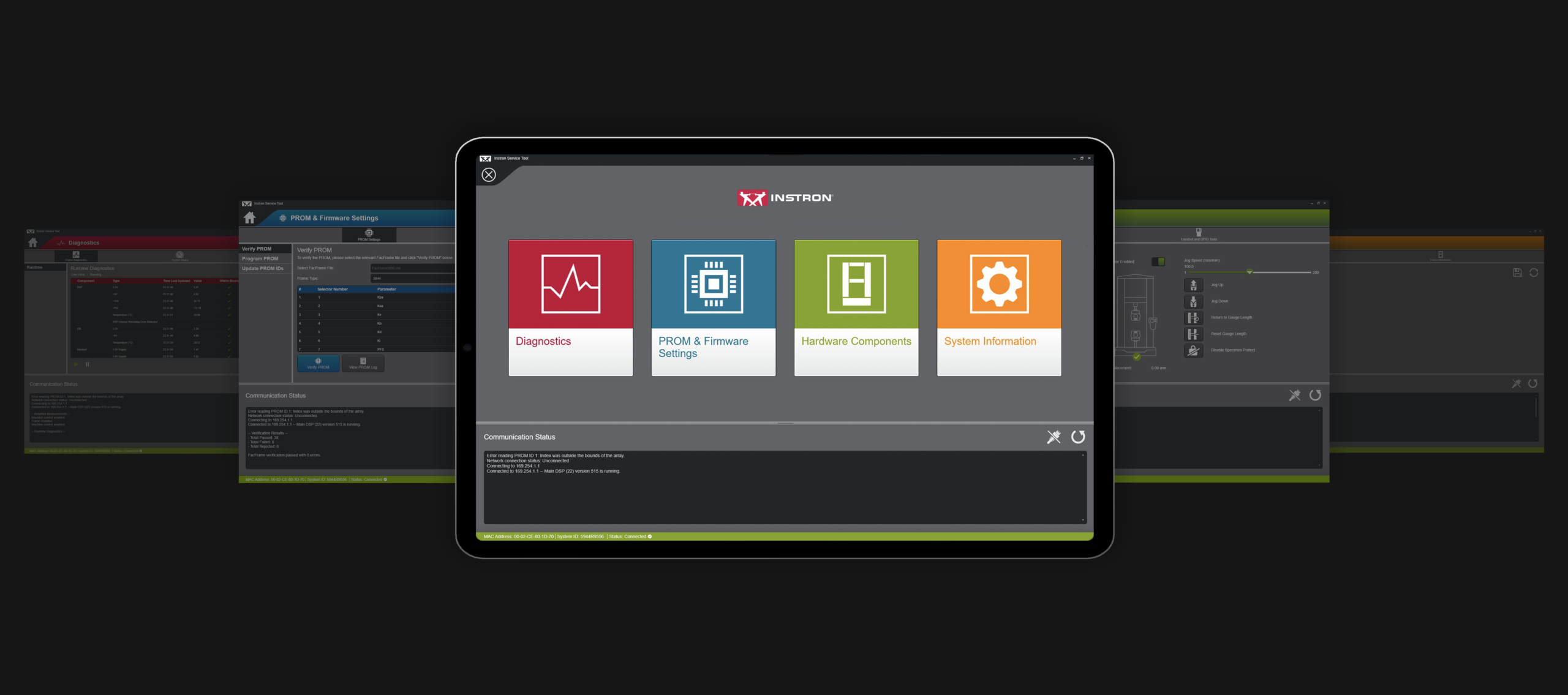
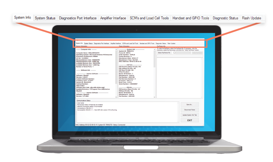
1. Improved category organization.
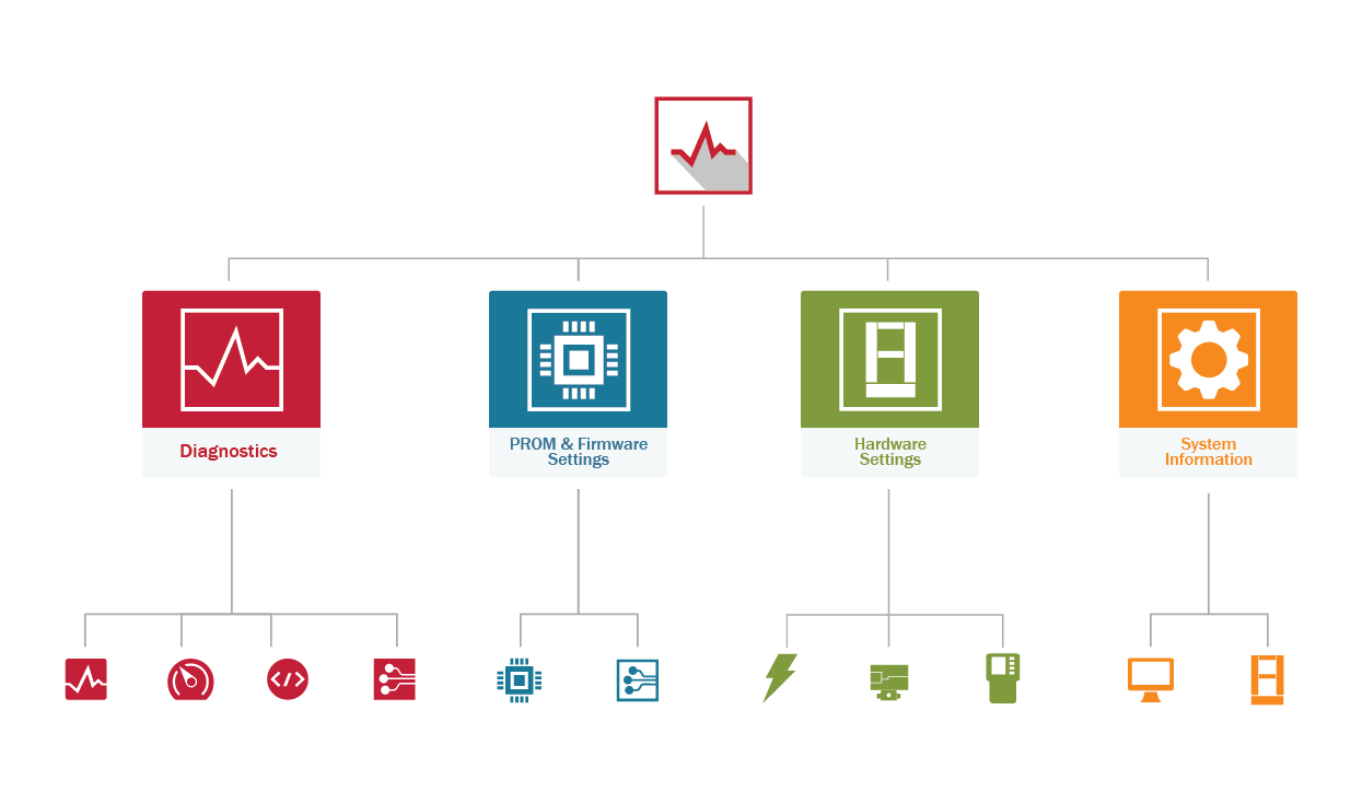
Categorizing functions into clearly-demarcated sections creates an easy-to-understand framework of where the functions are located, thereby removing the need to memorize the location of functions and allows engineers to focus on their main responsibility - diagnosing machine issues.
Each section also has a distinct role color that utilizes the company's brand colors, giving the engineer clear visual markers that identify what section they are currently in.
These sections were determined through an understanding of what the user's mental model of the tool was.
This categorization approach is extended with the primary and secondary navigation menus that further delineates the functions, thereby reducing the cognitive load required to memorize the location of functions and enables the tool to becomes accessible for engineers of all skill levels.
2. Distinct visual feedback.
When a diagnostics error is encountered, distinct UI elements will now inform and direct the user to the source of the error. This guide offloads the effort needed by engineers to identify where the error comes from, allowing them to focus on resolving the issue.
Universal icons that signify warnings are used to signal the errors (warning triangle and the exclamation mark), thereby allowing error identification with simple design cues.
This solution tackles the problem from both a design and coding perspective. When the tool's algorithms identify an error, they 'throw' an error message. I retooled this error message to also generate a UI feedback.
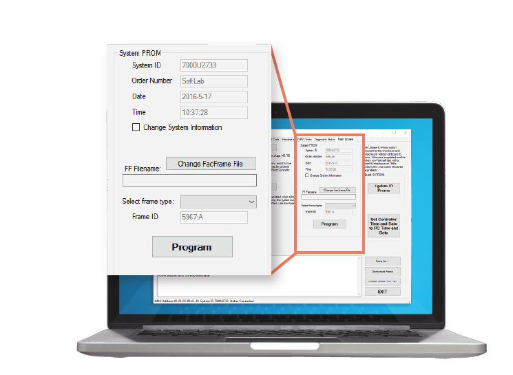
3. Overhauled information presentation.
To reduce the complexity of information presentation, I reorganized information presentation into more accessible formats.
Most notably, machine readings are now displayed in a table with constantly updating values. Tables provide an easily-understandable container of information and allow for efficient extraction of data, thereby reducing the cognitive effort needed to interpret data.
4. Simplifying the interface with icons.
Icons tell a story visually and express meaning with no text. To simplify the interface and streamline information presentation, I designed context-specific and scalable icons for all screen sizes to reduce the clutter that may arise with text.
Selected Works
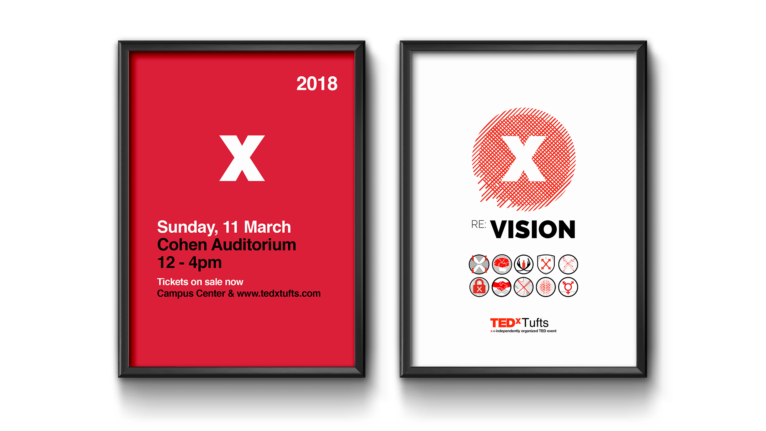
TEDxTuftsVisual Design, Print Design
The Doctor's CompanionUI/UX Design, Visual Design
PodiumUI/UX Design, Visual Design